
Ultra Armchair Quarterbacks Debate New Team Designs
Our Ultra team is filled with fans of good football and great design. With the upcoming season still in question and our work from home status moving into overtime, we're missing our Monday Morning Quarterback chatter back at the office. As pros who tackle creative challenges every day, we appreciate a well-executed play almost as much as a well-designed brand identity.
So go ahead and pull up a sports bar stool as we debate 2020 design updates for 7 NFL teams. But first, let's meet the players who will be sharing their color commentary.
![Ultra_Stat_Card-02[1].jpg](https://images.squarespace-cdn.com/content/v1/5c99011c77b9037f574a56be/1597262906139-TXQVT4JL9EQE2GW1WYCW/Ultra_Stat_Card-02%5B1%5D.jpg)
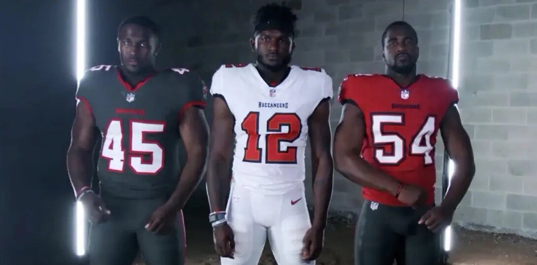
TAMPA BAY BUCCANEERS
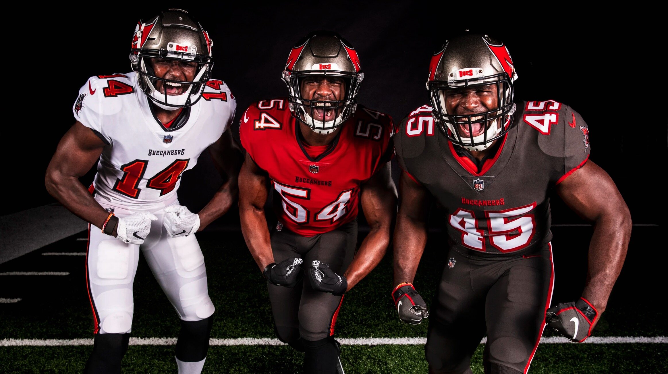
TEAM MAKEOVER HIGHLIGHTS:
•Designs revert back to their look from the early 2000s.
•Red and pewter with orange trim revised in a classic way
•All new pewter color rush look
•Digital alarm clock number font discarded
COLOR COMMENTARY:
NICK: I was glad to see the digital clock numbers go. I would have liked to see the oversized flag logo on the helmets go with it. Maybe just a big skull-and-crossbones with red accents on the pewter helmet would look badass.
MIKE S.: The Bucs uniforms to me are just an adjustment on the font for the number. With that said, I think it looks good. I didn’t hate their uniforms to begin.
MIKE G.: Overall, I like the new Bucs uniforms, but I think their logo could have used some attention. I think there is a lot of potential to make this logo better.
TODD: Pewter isn’t just for light fixtures and faucets! I love it. Most of the designs aren’t that groundbreaking but I love the full pewter design.
STEVE: I miss the old creamsicle color scheme, I think it would really stand out in today’s NFL. Being in a division with Atlanta (red and black) and New Orleans (gold and black), the pewter/red/black doesn’t have the impact that it should. That said, I do like the new jerseys much better than the clock radio look of the last couple years. I would ditch the helmet flag and own that skull and crossbones.
ATLANTA FALCONS

TEAM MAKEOVER HIGHLIGHTS:
•Overall approach moves to super modern look
•ATL now on chest of main jerseys
•New number font added
•Additional red alternative pants including in the mix
•Helmet now has a black satin finish and silver facemask
•A black throwback option pays homage to years past

COLOR COMMENTARY:
NICK: I like the silver accents on the Falcons uniforms. They could have pushed the silver even more, I think. The all-black uniform looks nicely streamlined. The number styling looks a little awkward, but at least they’re trying something more customized.
MIKE S.: I don’t like the Falcons jerseys. The fonts they used on the numbers is different on each jersey which I think is not very cohesive.
MIKE G.: I’m not sure how I feel about the red to black gradient on the new Falcons uniforms. The true test will be seeing what it looks like when the whole team takes the field. I do like the silver accents that are happening on the helmet, and I kind of wish that would have carried over into the jerseys or pants somewhere. Silver metallic jersey numbers could have been cool!
TODD: Much like the Seahawks redesign of their uniforms a few years back, I think the red to black gradient is groundbreaking. Something different in a sea of sameness. The font works seamlessly with the logo, which has always been one of my favorites. And, the all black uniform just screams intimidation.
STEVE: The helmets look great as always. The all-black uni is pretty cool, and so is the all-white. But the new red jersey is hideous. The gradient makes the bottom half of the jersey look wet. And for whatever reason I’m not a fan of putting the city name on the jersey—makes it feel like the knockoff NFL jerseys they used to sell at ShopKo.
LOS ANGELES CHARGERS

TEAM MAKEOVER HIGHLIGHTS:
• Team now features six different color combinations
• Powder blue, true blue, and navy home jersey options
• Helmets with numbers on side celebrates early franchise
• A flatter lightning bolt with the navy outline has been removed
• New forward charging team name logo and font with electric 'A'

COLOR COMMENTARY:
NICK: I’m glad the Chargers kept the powder blue. The powder blue jersey with white pants is one of my favorite uniforms period. The bolt on the “A” of the logo looks forced to me, and the numbers on the side of the helmet junk it up, but otherwise these are pretty solid.
MIKE S.: Chargers logo I am indifferent on. First off, I cannot be unbiased as they are in my division!! 😊 The icon is not much different. I agree with Nick, the bolt on the A is overkill and forced and I don’t think it works well at all.
MIKE G.: I do really like the Chargers uniforms. I’m a big fan of the navy blue and yellow uniforms, but I’m glad they kept the classic powder blue in the mix. This is a good example of keeping it clean, simple, and iconic.
TODD: By far the best throwback jerseys are the ‘bolts. Then you give them the color rush treatment, just take my money please! I will take 12. These even make kickers look good. I personally would have stayed with the baby blue, but there is something about the knocked-out lightning bolt that’s appealing to me. I think the Los Angeles Chargers logo itself needs to embrace that it’s vintage. Right now, it’s straddling the line between contemporary and vintage design.
STEVE: I love it, I’ve always been a fan of the powder blue. Hands down my favorite uniform set in the NFL (in my opinion)--and that’s saying a lot in a division stacked with sweet uniforms. The Chargers had the heaviest lifting in some ways, because they’ve never had a bad uniform set in their entire existence; but somehow they’ve managed to surpass expectations. Even the dark blue color rush options look great!
LOS ANGELES RAMS

TEAM MAKEOVER HIGHLIGHTS:
•New round numbers feature yellow to white fade
•An updated dimensional horn on helmet
•"A" becomes part of the horn in LA logo
•Grey away jersey instead of white, actually called 'bone'
•Highlighter yellow down side of pants
•Signature word patch now featured on chest of jersey

COLOR COMMENTARY:
NICK: I’m not a big fan of the Rams new logo. I think it tries a little too hard with the shadows and gradients. I like my football logos to look like they could stand out in any era, and this doesn’t do it for me. At least they’re keeping the classic helmet mostly intact.
MIKE G: It’s interesting to see how they shift, but I’m not a huge fan of the new Rams logo. I don’t like how the new logo became more 3D. In my opinion, the redesigns that are most successful in sports simplify the logo giving it a timeless more Iconic feel.
MIKE S.: I do not like the Rams logo. Don’t like how it flows around the LA. It will be tough to make it look good on merchandise.
TODD: I like how they incorporated the Ram’s horn into the logo, but I don’t like the Rams head illustration, it feels forced to match the horn logo, almost an afterthought. While I like the new logo on the helmet, it isn’t working as well on the shoulder pads you lose the fact that it’s a Ram's horn and it looks more like a stylized circle. Yellow strips on white? C’mon man, can we get a little contrast here. The rest of the elements to these uniforms kinda bore me.
STEVE: I have mixed feelings on this. I’m glad the Rams decided to embrace their blue and yellow roots. But I feel like there’s too many delicate, subtle design choices that don’t fit with the brash, bold nature of sports branding. The gradient in the numerals is finicky; and the twisted horn element works on its own but feels forced when incorporated into the helmet and the wordmark. The lemony yellow looks too removed from the “athletic gold” of their vintage set and the bone-colored jersey just looks like dirty laundry.
CLEVELAND BROWNS

TEAM MAKEOVER HIGHLIGHTS:
•The team reverts back to a simpler look
•The city's proud, blue collar mentality serves as a reminder there's no need for anything fancy
•Straight forward white numbers on brown jerseys and brown on white ones.
•An all brown color rush uniform is in the mix
•Brown pants can go home or away

COLOR COMMENTARY:
NICK: The Browns are blue collar and stayed that way. It’s good to see them stay true to their heritage and make it more focused by bringing attention to detail.
MIKE G.: I like this new look. To me, the Browns have one of the most iconic color schemes in Football. Although I don’t notice much of a change, I think they’ve made a good choice keeping it simple and bringing back the old school look. I’m a big fan of the brown pants with the white jerseys.
MIKE S.: I have always loved the Browns jerseys. The simple look with the helmet ties the look together. Only team without a logo on the helmet and it actually stands out in a great way to me. It always makes me think they are going to be a better team on the field than they are because the simplicity makes me feel like they are more of a cohesive unit than other teams.
TODD: ZZZZZZZZ...bring back the dawg and slap that on the helmet.
STEVE: I like it, but it’s nothing really new. I’m glad they ditched the lousy drop shadows on the numerals and the dumb “Browns” workmark on the pants. And I really like the old school stripes on the sleeves and socks. I like the mono brown color rush uniforms, and I hope they bring back orange pants.
INDIANAPOLIS COLTS

TEAM MAKEOVER HIGHLIGHTS:
•Team stayed true to its roots and maintained their clean and classic look
•Tweaked number font to match their glory years
•Moved from Colts on the front to the C logo with the shape of Indiana in it
•New word mark and font
•The signature horseshoe becomes a bit rounder
•Added anvil black as an official color

COLOR COMMENTARY:
NICK: I’ve always loved how that crisp white and bold blue pops on the field. Another great example of a team recognizing their heritage and enhancing the details to make it feel refreshed. Looks great to me.
MIKE G.: Although most of these changes are small tweaks of the design elements, I think they make sense. I like that they brought back the slab serifs nto the numbers. It just makes sense because it directly relates back to the horseshoe logo and has a little bit more of that western vibe. I like the thought behind having a secondary logo in the design system, but I’m curious to see where else that will show up and if it will have the same effect as their original horseshoe logo.
MIKE S.: I am not a fan of only changing the number font. Think the name and number should be same font on a jersey, makes for a cleaner look. Think the “C” logo in with the shape of Indiana in it is trying to hard and looks like a manufacturing mistake on the jerseys. Like the new black color.
TODD: Why bother if the only change your going to make is the font, no one that isn’t a designer will notice. Why not flip the colors make the helmet blue and the horseshoe white? Experiment with different shades of blue like the chargers did. This uniform has always been my least favorite, too monochromatic and boring.
STEVE: I really like the new/old school jersey numerals. I’m on board with these changes; like the Browns, it’s good they’re embracing their classic NFL look.
NEW ENGLAND PATRIOTS

TEAM MAKEOVER HIGHLIGHTS:
•Previous alternative uniform has been promoted to the team's home primary
• Home uniform went to all navy with white numbers and red trim.
•Away jerseys feature navy numbers with red trim
•The blue pants will remain the same for both
•Stripes on the shoulders pays homage to their classic red jerseys
•The fan favorite red throwback uniform is expected to be in future uniform rotations

COLOR COMMENTARY:
NICK: I was interested to see what the Patriots would do. Overall, these are just okay. Nice to see them bring back a nod to the old red, white and blue uniform. Too bad a white helmet option wasn’t in the mix. I think there was a missed opportunity to do something a little more interesting here, but it still looks pretty sharp.
MIKE G.: I like that they got rid of the gray that was previously on the jersey and replaced it with the red stripes. I’ve never been a huge fan of their uniforms, and maybe I’m biased, but they just seem a little bland to me.
MIKE S.: Very clean uniforms. Wish they incorporated a little more red in the uniforms to go back to their roots. Would love to see “Pat Patriot” back on the uniform in some scale at some point. I think that logo is one of the most iconic and recognizable logos in sports.
TODD: Another why bother moment. The only change I really notice is the shoulder stripes which look unfinished, they just stop… floating on top of the shoulder pads for no reason. The color rush design is nice. I would have made the socks blue too, if you are going all in, go all in.
STEVE: I’m a little bummed they didn’t take the opportunity of Brady’s departure to completely reboot their look, and either go back to the old Pat the Patriot look or roll out something all new. But I do think their jerseys are an improvement over their previous set. The numerals are much more readable and making the shoulder stripes look like military-style epaulets is a really nice touch
THE FINAL SCORE
Whether it's gameday or just another Tuesday, the passion for great design runs deep for this squad. At times, opinions can be as varied as the team's they root for. These great debates carry over into our work where we look to optimize every design that goes out the door. It's our way of cheering for and challenging each other to do our best work.
If you're keeping score at home, here's how they ranked their most and least favorite. What's yours?
BEST OVERALL
NICK: Chargers
MIKE G.: Chargers
MIKE S.: Browns
TODD: The Chargers by a nose to the Falcons.
STEVE: Chargers, A++
WORST OF ALL:
NICK: Rams
MIKE G.: Rams
MIKE S.: Falcons
TODD: Colts, they've been the worst for a while.
STEVE: Falcons