Go-GURT Yogurt
Packaging Refresh & Tube Design Extravaganza.

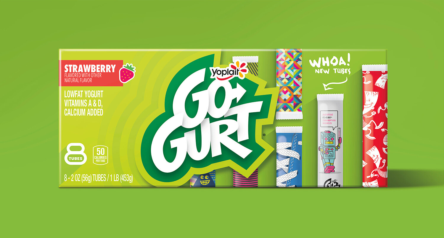
When this prolific brand was ready for a refresh, there were many design challenges at play. Our primary focus was on shoppability. This meant establishing segmentation rules across their everyday, licensed and promotional offerings. To start, we simplified the logo. The visual layers were removed, but the youthful energy remained. The design architecture stayed true to the Go-GURT green which not only helped to brand block at point-of-purchase, but also allowed the new logo to pop and act as a bullseye at shelf.
The design team's attention then turned inward towards the tubes themselves. Licensed and promotional tubes are continually refreshed to bring news to the category, so the team looked for new and engaging ways for kids to identify an everyday Go-GURT tube. Ultra concepted, designed and illustrated more than 240 unique tube designs in all. Original content and varied styles on every tube meant new surprise and delight moment for kids every time.