Annie’s Mac & Cheese
Packaging Engagement & Design
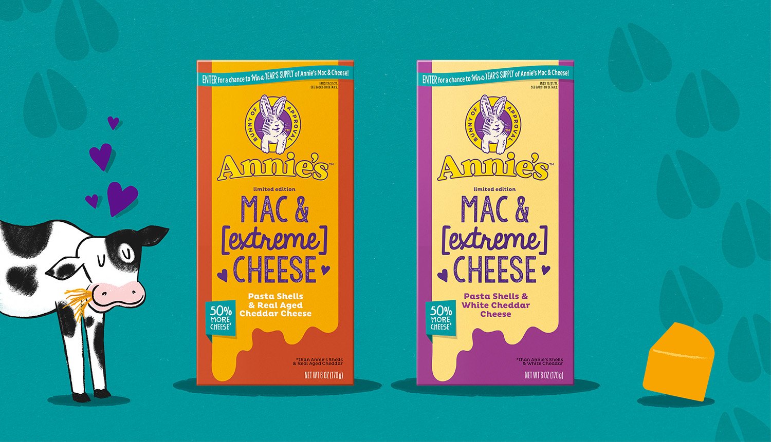
Annie’s newest mac & cheese offering has 50% more cheese, thus the name Mac & (extreme) Cheese. To celebrate this cheese abundance required a delicate balancing act. We needed something exciting and attention getting that really sold the appetite appeal of extra cheese, but we also needed to stay true to Annie’s brand ethos which meant avoiding loud banners and flashy flags. In other words, we couldn’t be too “cheesy”. The design we leaned on proved to be very effective at meeting both needs with its subtle river of cheesy and clean design that allowed our simple product benefit to stand out on shelf.
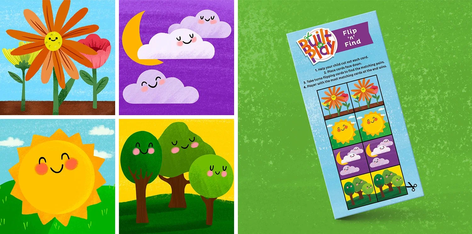
Annie’s was looking for an opportunity to bring more playful fun to their packages in a way that stays true to their brand values and history. Our first step was to create a series of arts and craft-based back panels that help families upcycle their packages into a toy or game when they are done using them. From there, we helped Annie’s roll out new limited edition packaging for several offerings and redesigned the packages for their canned meals and fruit snacks.


