I Said, “MAKE THE LOGO BIGGER!”
I Said, “MAKE THE LOGO BIGGER!”
The design industry has heard this request on a daily (…hourly?) basis. It’s such popular feedback that there are music videos, memes, blogs and even websites poking fun at the cliché. But we aren’t here to bash our clients or their logo-scaling requests. As designers, we recognize that sometimes it’s the right approach—sometimes bigger really is better.
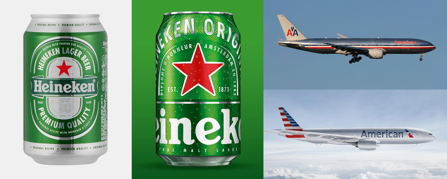
Although certainly not a new trend, there has been a recent wave of oversized monikers. From aluminum cans to jumbo jets, big brands have been going even bigger with their logos in recent years.
One thing unites the examples above: everyone knows the brands. They are products that are well established and their brands have been crafted into ubiquity. We all recognize them, even if we only have a brief glance at the product. You’d know a Coke can from a block away, (or an out-of-focus Starbucks cup in Westeros.)
That is why some companies are able to successfully go oversize with their logos. Heritage brands no longer need to educate anyone about who they are. They can sacrifice legibility and claims on the package because their loyal customer only needs to recognize the product and put it in their cart. Domestic beer drinkers know whether they are Budweiser or Miller fans. If they’ve been drinking the same beer for many years, they aren’t reading the selling points. They just need to be able to identify their beer.
That’s the turning point. Once a brand reaches that Coke-or-Pepsi loyalty from its customers, it has become an icon. Red can. White script. Cola. Even reading that simple description you probably have a sensory memory of how a Coke tastes. At this level of recognition, brands aren’t telling customers who they are. Those companies instead spend massive ad dollars to remind us they exist. A well-timed ad is enough to jolt that sensory memory and send customers to the convenience store to restock.
Storefronts are following suit as well. Brick-and-mortar mainstays like McDonald’s, Starbucks, and Apple have such a strong foothold that they no longer need to label their spaces with their own names. All three now rely solely on the visual component of their logos to guide customers through their doors. All three brands also have an international presence, so relying purely on the visual lexicon makes it easier to expand into a growing list of countries
Does that mean all brands can go Paul Bunyan on us? No way. Very few products have reached pop-icon status (pardon the pun) and most products still have a lot of information to relay. Weight Watchers’ rebrand to WW, via the design masters at Pentagram—although beautiful in its simplicity—has yet to be proven an effective or wise design move. Time will tell whether the brand carries enough clout to succeed with their strategy.
If the logo is taking up 90% of the package, that doesn’t leave much room for additional communication. But if a product is truly reaching Beyoncé levels of fame, maybe the brands, and you know who they are, can get away with a little more logo and a little less chatter.


